Colours
Our conventions for using colour are based on the Google material design guidelines. The palette consists of one primary and one secondary colour, which both have light and dark variants.
Tip
Click on the colour tiles to copy HEX or RGB values to the clipboard.
Primary palette
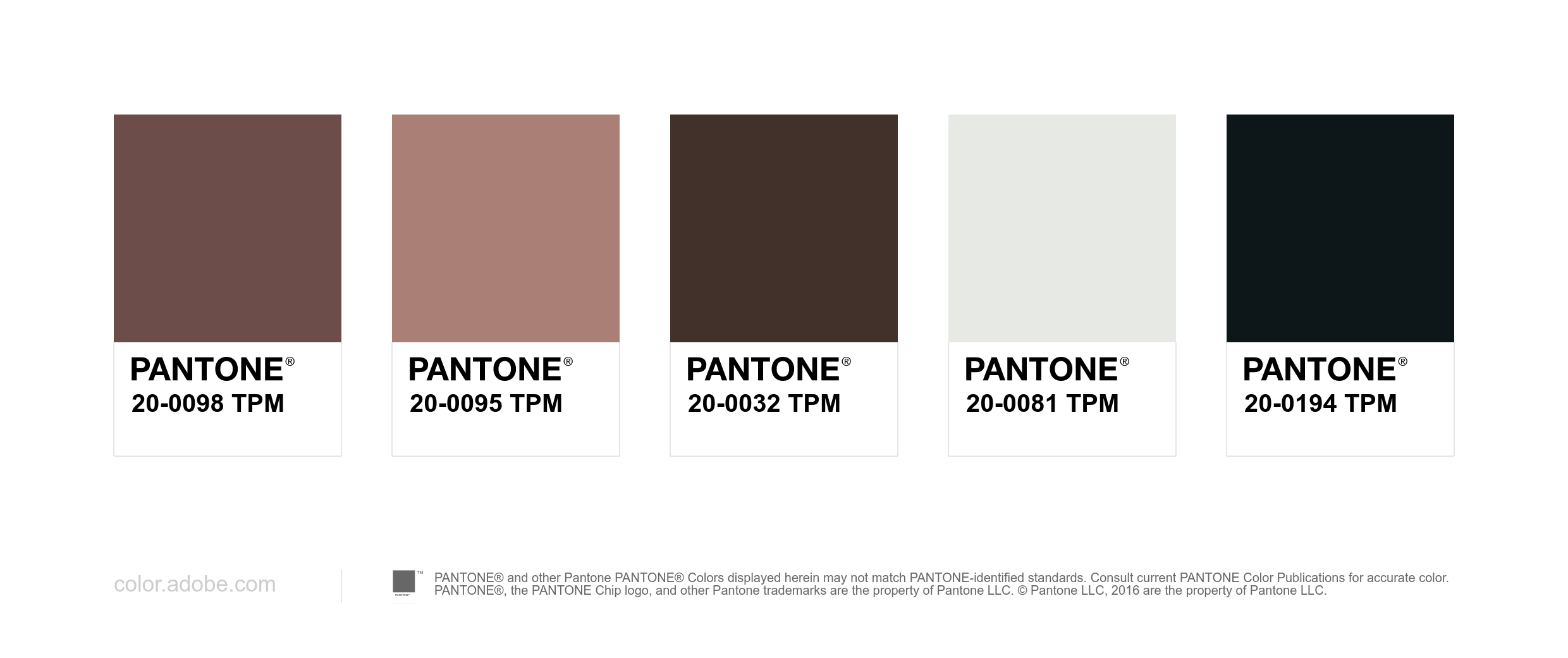
The primary palette should appear most frequently in any Beautiful Canoe communications. It consists of one primary brand colour, brown , with light and dark variants.
RGB values
Pantone® matches (with white and black)
Secondary palette
The secondary palette should be used sparingly, and only on elements that should be accented. Secondary colours are most often used for:
- Links and headlines
- Buttons
- Selection controls, like sliders and switches
- Highlighting selected text
- Progress bars
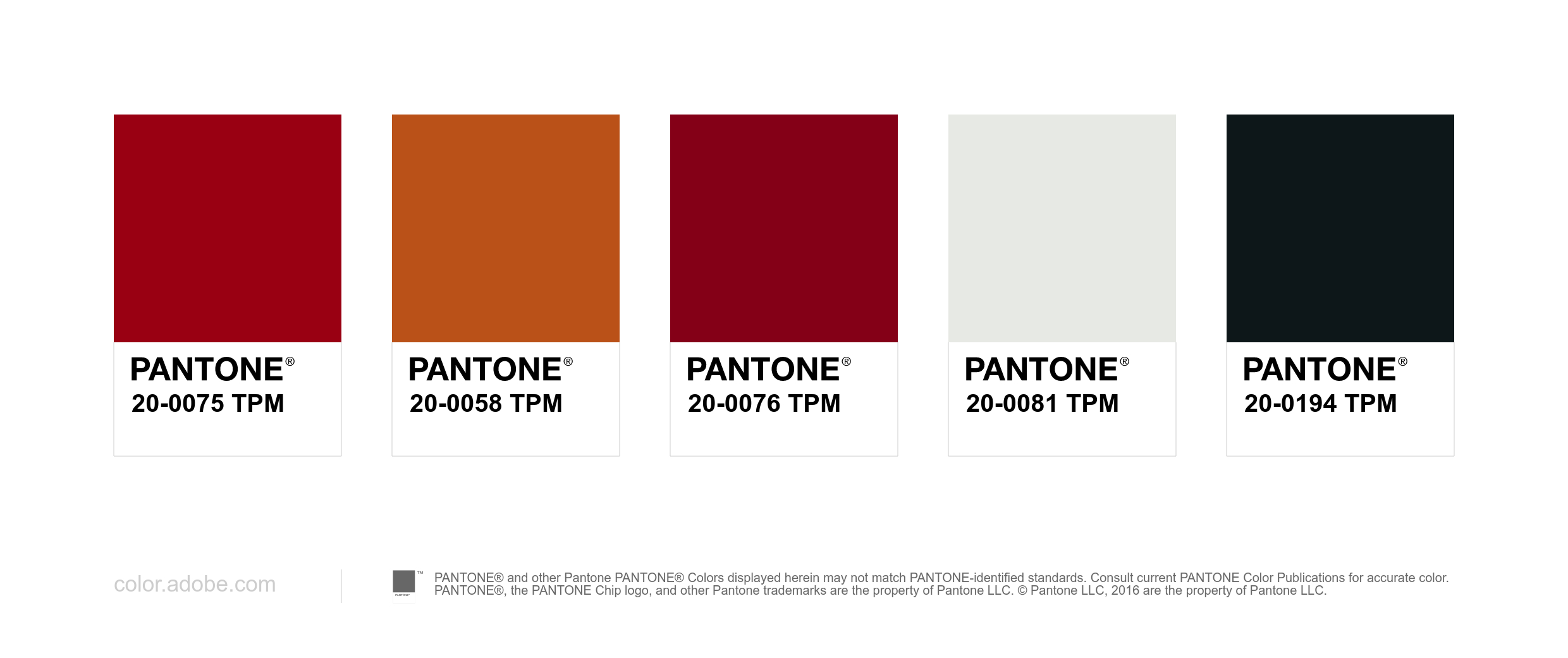
The main secondary brand colour is red , with light and dark variants.
RGB values
Pantone® matches (with white and black)
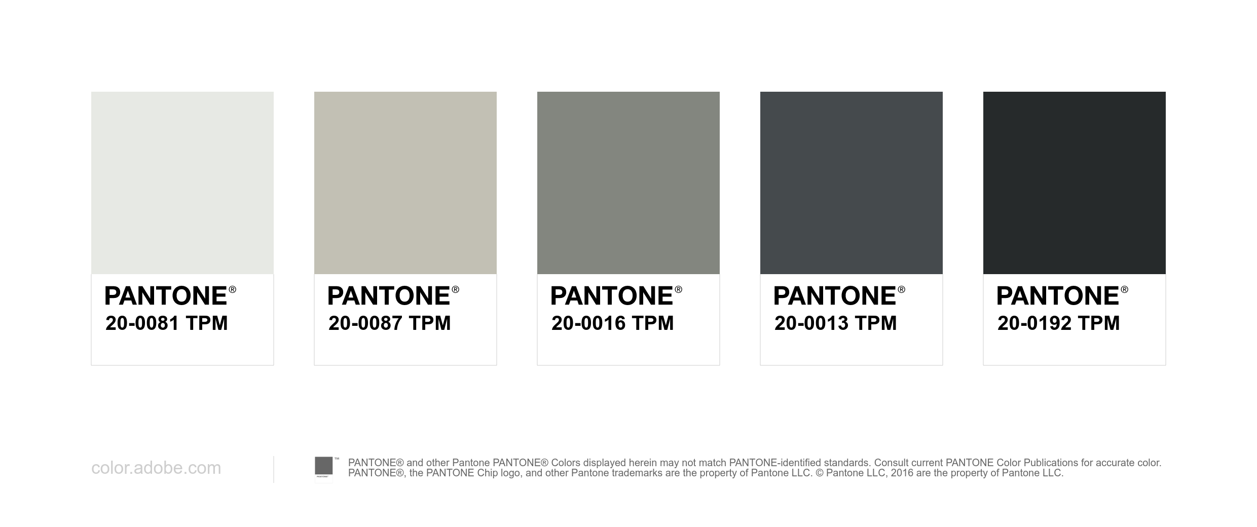
Monochrome palette
RGB values
Pantone® matches